

.png)
.png)

Why Mobile-First Matters More Than Ever
In 2025, over 70% of web traffic happens on mobile devices. Yet, many websites still struggle with clunky layouts, slow load times, and broken forms on smaller screens.
If your HubSpot site isn’t mobile-optimized, you’re not just losing users — you’re losing leads, conversions, and SEO rankings.
Our mobile-first HubSpot themes are built to load fast, look sharp, and convert visitors across all devices — especially phones.

Who Needs Mobile-Optimized HubSpot Themes?
These themes are ideal for:
- SaaS & tech companies targeting mobile-first audiences
- Agencies running PPC, influencer, or social campaigns
- DTC brands, fitness coaches, and e-commerce shops
- Educators & consultants with mobile-first sales funnels
- Any business with a global, on-the-go user base
If your site is part of a marketing or sales journey — it must perform flawlessly on mobile.

All Themes Include
- 20–40+ drag-and-drop modules
- Fully responsive mobile-first layouts
- HubSpot CRM & Forms integration
- Global theme settings (fonts, colors, spacing)
- Built-in SEO and performance enhancements
- Compatible with HubSpot smart content & personalization
- Scroll, touch, and swipe–ready elements

Why Choose Our Mobile-First Themes?
- No broken layouts on phones
- Higher conversions from mobile traffic
- Better performance scores (and SEO rankings)
- Faster page buildouts with no dev help
- Fully supported by The Webplant’s HubSpot team

Related healthcare themes
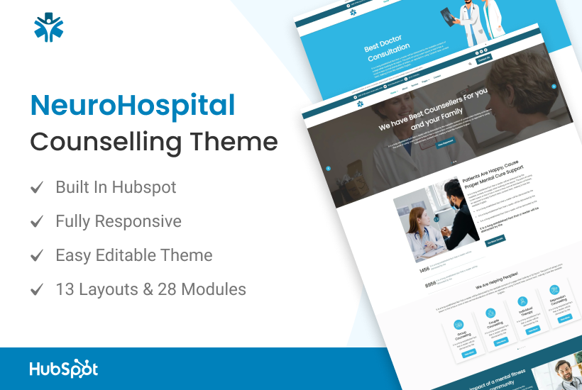
NeuroHospital Template
Healthcare & Medical
Clinic
Hospital
Patient Management
A specialized and professional template theme for the theme marketplace. With its clean design and neurology-focused features, it's ideal for hospitals, clinics, and medical professionals specializing in neurology and neurosurgery.
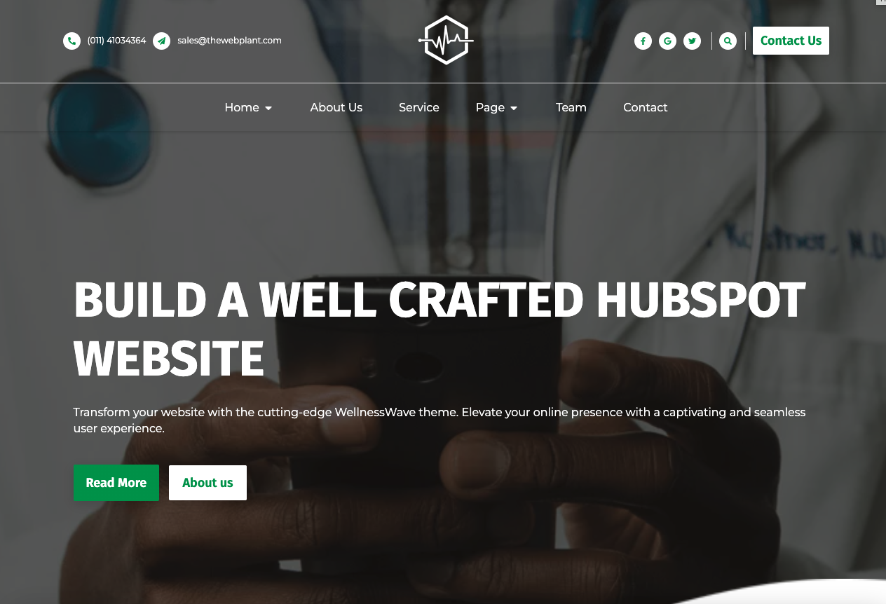
WellnessWave Template
Healthcare & Medical
Health Focused
Healthy Lifestyle
Wellness Center
A visually stunning and health-focused template theme for the theme marketplace. With its elegant design and fitness-oriented features, it's ideal for promoting cardiac health, wellness centers, and related services.
Power Up Your Project
Request a Quote and Let Us Save the Day!