

.png)
.png)

The CSS in a website is a very critical component of any web page. It takes care of rendering and styling of each page element and with responsive design becoming a default standard, the CSS also has to handle the rules for each screen size, orientation and media type.
All these variations result in either a very large number of small CSS files or one large CSS file depending on how your pages are set up. Developers have mostly been dividing CSS files based on the components to be rendered with each request which is a wise thing to do. However, we want to go a step further and think - "When a user is accessing my page from a mobile device, why am I loading the CSS rules for Desktop also?". This question becomes even more critical when we realize the CSS is a blocking resource i.e. the browser won't complete the rendering process until the very last line of your CSS has been loaded.
So when I am accessing a page on my phone browser, the browser is blocked from rendering completion until the desktop, tablet and even print related CSS code has loaded.
This is where we can use a "media" attribute while linking our CSS. A CSS linking with a media attribute would look like this:
<link rel="stylesheet" type="text/css" href="print.css" media="print">
The value "print" for media attribute tells the browser that this CSS files is applicable only to the print media. Of course as a developer, I will need to make sure that I put the right code in the right file!
Similarly, I can tell the browser that a certain file contains only mobile rendering related css code like this:
<link rel="stylesheet" type="text/css" href="mobile.css" media="(max-width:767px)">
A code targeted at tablets will look like this:
<link rel="stylesheet" type="text/css" href="tablets.css" media="(min-width:768px) and (max-width:1023px)">
Along the same lines, I can define the rules for Desktop screen sizes like this:
<link rel="stylesheet" type="text/css" href="tablets.css" media="(min-width:1024px)">
The capability of the media attribute doesn't stop at media type and screen size only. We can also separate out the files for dark and light mode like this:
<link rel="stylesheet" type="text/css" href="light-mode.css" media="(prefers-color-scheme: light)">
<link rel="stylesheet" type="text/css" href="dark-mode.css" media="(prefers-color-scheme: dark)">
Sometimes, the CSS uses different images based on pixel density. So, your code will have images like "cart.png" and "cart@2x.png". While the browsers are capable of blocking the irrelevant images based on pixel density of the screen, we can avoid the code to be blocking by using following code:
<link rel="stylesheet" type="text/css" href="dark-mode.css" media="(min-resolution: 2dppx)">
Validation and Support
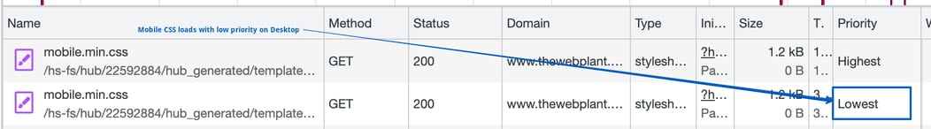
This first and important thing to note is that the media attribute won't block a CSS file from loading. Instead, the browser would assign a priority to each resource. The priority values are assigned like "Highest", "Lowest".
To view this, head over to the "Network" tab in Chrome dev tools. The priority is not visible by default, so you can right column on columns area to enable the view:
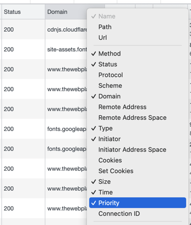
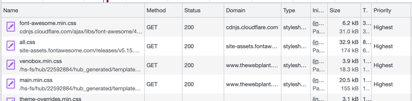
So what does this priority column mean? It indicates that the browser will not block the rendering to wait for loading of Lowest priority files.
Browser Support
This is where a bad news comes in! Safari current doesn't support the honouring these priorities but we can hope that it comes through soon. Given that Chrome and Firefox and dominant browsers put together and the fact that adding this code doesn't break anything in browser, its worth a consideration.
Adding conditional directives in your HubSport CMS website
If your website is built on HubSpot and you plan to make use of this feature, it's very easy to do. The instructions below are relevant if you are using a standard theme structure or a theme built by HubSpot's migration team (i.e. us!):
- Go to the file base.html in templates/layout
- Split your mobile rendering code in a file in css/mobile.css
- Add an import for mobile.css in base.html just below main.css import with media attribute (max-width:768px)
If you need more help with this, you can always reach out to us!
Related Post
Implementing Pagination in HubSpot CMS
The HubSpot Blogging platform provides an excellent pagination mechanism for Blog posts. A similar implementation is also possible for dynamic pages that use HubDB but currently there is no direct way of applying pagination on a bunch of website...
HubSpot CMS Tiers - which one is best for me
If you have been a relatively new HubSpot CMS user or have been on the fence about buying a plan from HubSpot for your website, you may be wondering what is best for you.

Web hooks in HubSpot Private Apps
Up until recently, Web hooks were only available for public HubSpot Apps. HubSpot recently announced support for Web hooks in private apps as well. This may not seem like a big deal if you never had to use a private apps. However, the users of...
Power Up Your Project
Request a Quote and Let Us Save the Day!

Leave a reply