

.png)
.png)

For years, the businesses have been using desktop websites as the primary view and then implementing the mobile version either as a second thought or as a reactive approach when things break on varying screen sizes.
An increasing trend has been to use a mobile first approach i.e. designing a website or portal primarily for mobile screens and letting it scale to larger desktop screens.
This decision also depends to a large extent on the target audience.
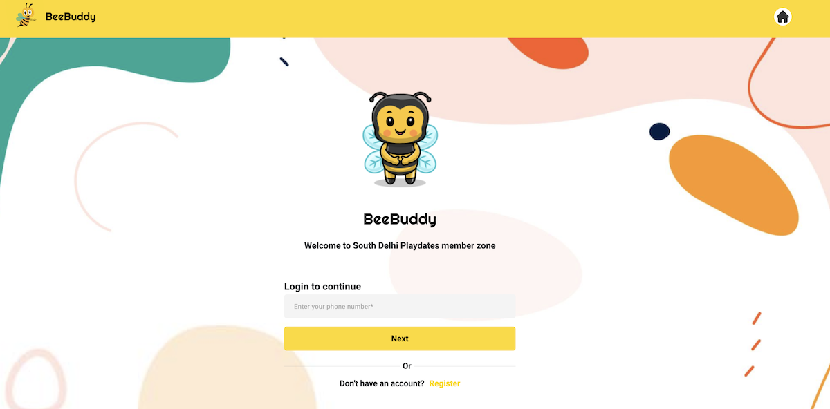
We at The Web Plant recently came across a very interesting scenario when a customer reached out to us for a an event collaboration platform to be built for parents where they can search for kids events & playdates and join the ones they are interested in. When we further analyzed the requirements and the current process, we realized that the primary audience of this online system is going to be moms of children aged between 0.5-6 years. Knowing the local demographics and usage trends, we already knew that close to 100% of the moms will access this portal from their phones. There are fairly good reason for this assumption:
- Most moms are on the go with their busy schedules and tend to keep most activities information related to their kids on their phone for quick access
- Most young parents these days don't even have a laptop at home and usually rely on their phones or tablets for casual browsing
It made complete sense to design not only as mobile first but as mobile-only portal. So we came up with a design that was exclusively for mobile screens. We tested the prototypes on various mobile screen sizes and adjusted the margins, typography and images+icons primarily for mobiles. If someone happens to access the portal on a larger screen like a laptop, they would see an expanded version of the same user interface. There are several advantages to this approach:
- There is zero effort and money spent for a screen size that no one is going to use
- The primary effort is spent on targeting a small range of screen sizes making it look much better than a standard responsive design
- The user response to the design is extremely positive because everything is designed for a mobile screen
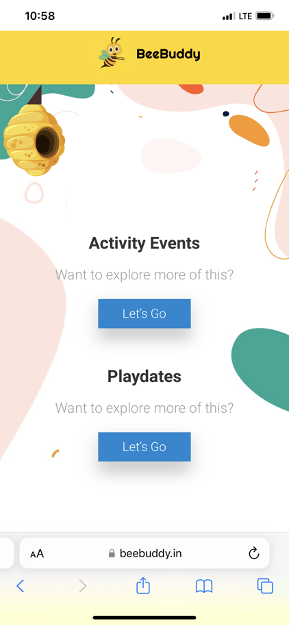
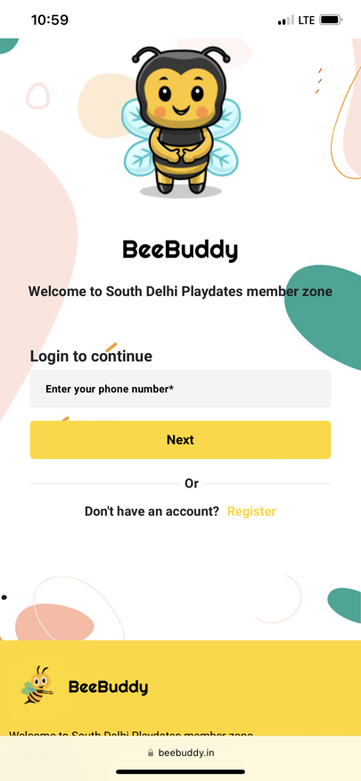
See a working demo of the application below:
Related Post

Why your website needs to be mobile-friendly and how to make it happen
Did you know thatmobile devices dominate internet usage, accounting for over 60% of global web traffic? A mobile-friendly website is no longer optional—it’s an essential tool for businesses looking to thrive in the competitive online landscape.

Maximizing Your Website’s SEO: Tips for Ranking Higher and Attracting More Traffic in 2025
In 2025, the digital landscape of SEO is becoming more competitive and dynamic making it essential for businesses and content creators to adapt their SEO strategies. Search engine optimization (SEO) plays a crucial role in ensuring that your website...

SEO Tips on Optimize Your HubSpot Website
SEO (Search Engine Optimization) is essential for improving your website's visibility in search engine results, making it more likely that people will find your site when they search for relevant topics. By optimizing your website content and...
Power Up Your Project
Request a Quote and Let Us Save the Day!

Leave a reply